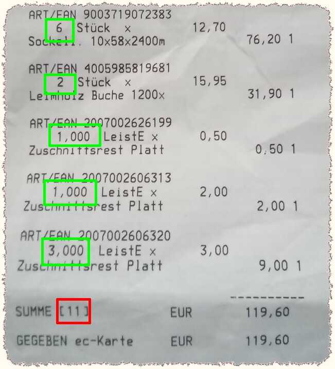
Today: Reverse-engineering business processes, or: When stuff isn't modeled right; this is a big problem in software, but apparently also in the real world. I went shopping at the local DIY store yesterday, and chose the self-service checkout. Got stopped by the attendant, who complained that I had only registered 11 items, but had 13 with me. The receipt indeed shows a sum of 11, but the individual numbers add up to 13. WTF?
Well, the latter half have been scrap pieces of wood, sold at reduced price. Some time ago, these still had a big label attached, where the clerk had to write down the dimensions, original and reduced price per square meter, and net cost. At checkout, all of that had to be entered into the system. They somehow realized that this was inefficient, especially as this is about mostly cheap scrap items, so they switched to small stickers with fixed round prices (mostly €1, 2, 3, 5, 8). However, I think they internally kept the per-area accounting, as hinted by the LeistE x Zuschnittsrest Platte (slat x scrap board) — the LeistE could be a typo, or maybe it is a workaround for a required ordinal + unit.
So the system counts up the "sizes" of all the scrap pieces that have the same per-piece price, as if they were different cuts of the same base material — in reality they can be totally different scraps. In that model, multiple pieces just contribute to a single position on the receipt, and this is counted as one. That explains the discrepancy. You'll also notice how the regular products are all referred to as 2 Stück x ... (pieces), but not the scrap ones.
Of course, the checkout attendant likely was completely oblivious to these intricate details, and had either been taught or discovered the heuristic of counting the customer's items and comparing that with the total shown by the POS terminal.
After going through the receipt and comparing once more with the actual items in my cart, she was content (did not apologize (an unfortunate German culture thing that's very persistent in service personnel) for implicating me in having made a mistake or even an attempt at stealing), and let me leave.
This definitely made me more aware of the trust and liability issues of self-checkout. It appears to be a convenient (no putting everything on the counter and then back into the cart) and quick (only a fraction of the customers is willing to use these, so there often are shorter lines) alternative. On the other hand, it's shifting work onto the customer, and I haven't seen any company that offers a rebate for that. If the cashier is making a mistake, it's their problem (and the customer might be lucky and get to pay less); if I make that mistake (as an untrained rookie), most people likely aren't aware of the potential implications.
06-Apr-2022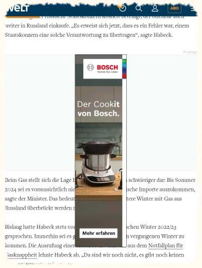
This ad has taken the thinking outside the box a bit too literally. Or is this a sidebar ad that got tossed into the wrong annoying interlude bin? With no discernible ☒ to close the ad (which are impossible to hit on a smartphone screen, anyway), I had to wait for the usual ad rotation (which didn't take long) before I could continue with the article.

Oh, and that blonde lady's back in my ad feed! No more shuddering and the need for taking a deep breath… she's now pursuing a humble life! That lifestyle change seems to also have done wonders to her age. Whereas readers previously were left wondering whether she's 50 or 51, or just turning 50, she's now a youthful 46!

Actually, I'm not even mad… they certainly have revolutionized online shopping, established cloud computing (turning a need for flexible resources due to their seasonal nature into a very profitable business on its own), and are building their features in an agile approach. (If they could just find out how to distribute their huge profits more evenly, especially among their many warehouse and delivery people, that'd be great…)
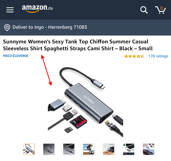 |
The title here is in sharp contrast to the images and what I had searched for. I've also encountered something like this the other way around: The thumbnail pictures of products on my wish list suddenly turned into completely different products.
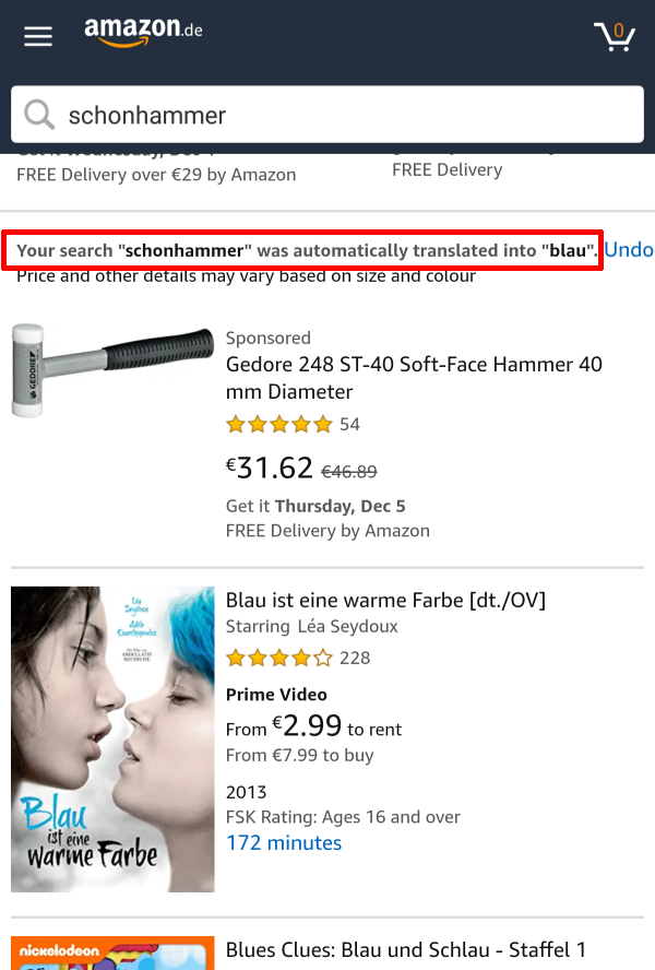
How on earth did the AI translate soft-head hammer into the color blue?! Of course, dealing with German compound nouns is a difficult problem. Interestingly, the sponsored product section doesn't seem to be affected by this.
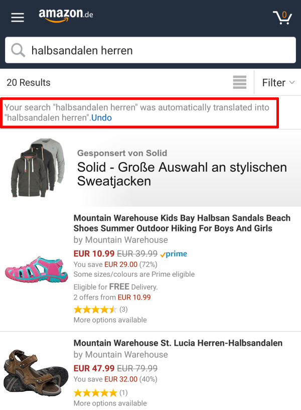
And here, the automatic translation was a complete no-op. The search seems to still have some problem with it, as the first result is not for men, but obviously (pink and turquoise) for children!

Finally, this is a notification from the Android app. Based on the obvious grammar mistake (eines Produkt), I thought the Movember is a typo, too (but how can I donate €1 to a month?) — researching this further, I learn that it's a non-profit organization for men's health (that apparently isn't that well-known yet in Germany).

Another one in the series ad algorithms have no intelligence: I wonder whether a human editor would have put these two ads right next to each other (and then using the same (or at least a very similar) model for both). The first actually is a teaser for a CNN article; the second an ad I've been shown way to often. It kept me wondering whether there's something wrong with my high appreciation for my UX designer colleagues, or what dramatic shortage in UX people have lead companies to offer a 5-month training program for free. Like testing, I see UX as an additional capability on top of general programming skills. Only large companies will have dedicated personnel for that, and in an Agile team, it's the shared responsibility of everyone on the team. So a UX-centered job for me includes writing prototypes and investigating toolkits, along with creating and reviewing mockups and wireframes. A dedicated UX resource would likely have highly specialized skills (and lots of experience, and politial clout in the organization) — this is not something you'd learn from scratch in a few months.

Persistent typo or missing S key on the keyboard? Or maybe a clever psychological trick to raise interest…

Category: annoying; there was a time when I regularly got these pop-up ads on my Android phone. I already feared some malware infestation, but in the end it just was a misbehaving app (that provided some WhatsApp stickers — you install it and the stickers are there — that's really hard to monetize, and the developer apparently got creative in a bad way). After deleting the app, the problem fortunately was gone.
I pity the gullible folks who click on this; the domain (that looks like part of a crypto seed phrase) does not even attempt to suggest an affiliation with YouTube, and why on earth would they celebrate every 10 millionth view?! And they hopefully would use less broken English, too.
This was supposed to be a year-end clearance post, but I didn't get to it yet. In the meantime, I got some great additions…
Smartphones are great for catching up on news, and Google's Discover algorithm is surprisingly good at coming up with interesting articles. What I don't like is that the news are shown in Google's Chrome browser, so there's no ad-blocker and the usual endless cookie acknowledgements and subscription notifications. Also, Google doesn't differentiate between free and paywalled articles (and I can't simply block sites that have both).

My phone is quite underpowered; that can actually be a benefit when the page loading is so slow that I sometimes manage to read half of the article before the Please register popup is overlaid and prevents me from continuing. But mostly it's just annoying, with ads that appear late and cause the whole page layout to jump around (or worse go back to the beginning), making me lose focus. With good and easy micropayment options still missing, the whole situation is a deplorable mess. If at least the ads were any good! But it's mostly just rubbish; here are some funny examples I happened upon:
avast doesn't seem to have a spell checker in their portfolio. In German, the plural of Virus is Viren, not Vieren!
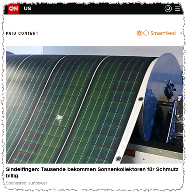
It's easy to recognize that this ad was inspired by the slogan dirt cheap solar panels… unfortunately, this doesn't translate into German, and rather evokes thoughts of cheap dirt in a German speaker.
Many ads use geolocation and include the supposed location of the viewer to make it look more relevant and local. Interestingly, the two towns that get offered most often (Sindelfingen or Holzgerlingen) are ~ 15 km away, and my real home town (Herrenberg) is rarely mentioned, even though it has more than double the inhabitants as the latter.

I don't consider myself a programmer, as that is just one aspect of being a software developer (who also designs, documents, tests, discusses requirements, and much more). When I look at the accompanying photo, I wonder what the ad people had in mind. I fully support more gender equality in technical jobs, but really wonder whether that attire is realistic or appropriate — in the offices I've worked, most of the women complained about the chilly temperatures due to the air conditioning. The dark and dingy background also suggest more of a hacker girl or Twitch streamer, not an office job. But hey, sex sells, right?!

Oh, and while we're at that topic, this ad wants to remind us of that, ahem, attractive woman. What happened to her, and what's so funny about the way she's looking now? Can this get any more clickbait-y?!

But this ad tells me that she'll make me shudder instead… so which one is it? It's easy to see through that all of these ads just play with raw emotions (the more intense the better). What kind of feeling is secondary.

This ad and the previous one at least provide a little bit of information about her age (and remember, looks and age seem to be the most defining properties of women for the ad business). The clever thing about the expression take a deep breath used by the same What The Facts ad agency is that psychologically, each viewer can project their own preferred emotion: Do it want to be frightened, surprised, to made laughing?

But then Hollywood Tale (really? I don't think she ever starred in a Hollywood movie) pins down her age at just 50…

…and Insider Gossip seems to agree. The dirt cheap example from above suggests that there's auto-generation involved in these ads, so why don't they simply embed the birthday in the data, and let a server-side script (or even a short client-side JavaScript call) determine the proper age automatically? (Well, this answer is because it's about clicks, not correctness.)

For Lucidaa, she hasn't even reached her 50s yet. I also like the very restrained that is her that doesn't appeal to emotions, and the subtle but precise [Fotos] hint that tells what's on offer. (But be warned: These photo galleries offer just one photo per page, which are even more filled with useless ads that the other pages that at least claim to have some kind of article and information inside it. Oh, and that nice teaser photo might not even be part of the set. And lots of other photos may be presented even before it gets to the person of interest. Totally not worth it.)
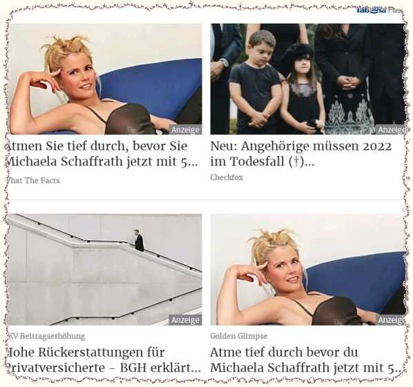
The ellipsis (5…) saved these ads from having to commit to a precise age here. Both What The Facts and Golden Glimpse use the identical teaser photo, but address the user formally / personally. When these duplicates happen (I've also seen the same product recommended by Amazon right next to each other), it always looks like a computer bug. However, I think the ad engine is just collating ads, and the images likely have different names, sources, and IDs.
Oh, and at the time those ads got presented to me, the correct age (if Wikipedia is to trust) would have been 51 years.

The last ad (from today) with a contemplative pose in black-and-white and the slogan Do you remember … reminds of an obituary notice. I wonder whether they intentionally wanted to evoke such emotions. On the other hand, [images] are promised here as well (which would be a bit strange to honor a dead person).