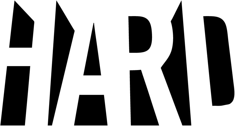
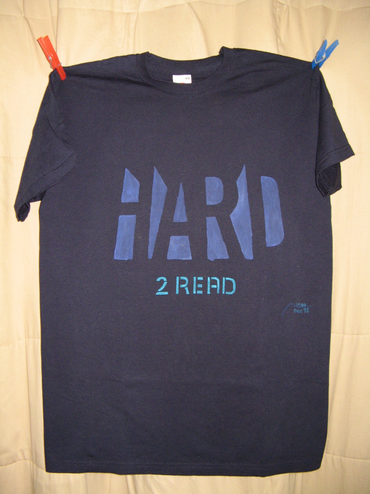
Somewhere on the Internet, I came upon a black-and-white rendering of the letters HARD, and immediately liked the three-dimensional illusion that is created by those very simple outlines.
| date | 01-Dec-2013 |
|---|---|
| time | 1 hour |
| object | dark blue T-shirt |
| technique |   |
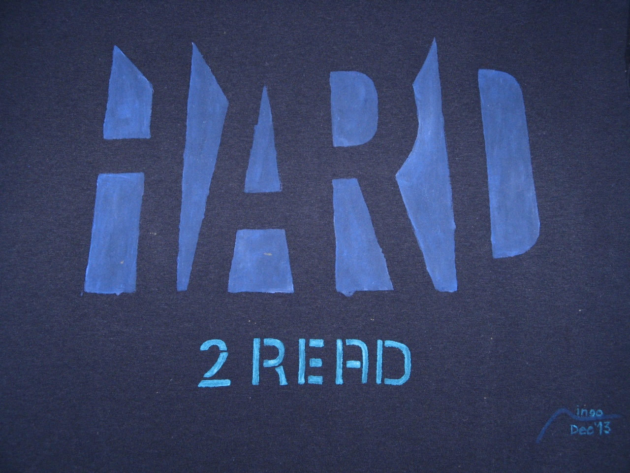
I printed the graphic on plain A4-sized paper, cut out the black areas, and used that as a stencil. I chose a low-contrast medium-blue color (a plus color from Marabu's textile colors that contains white pigment to be visible on darker backgrounds); it appears brighter on the photos due to the flash.
After filling the stencil areas, I added 2 read
below (in freehand, and a brighter, more visible hue of turquoise), to create a self-referential wordplay on [This is] hard to read.


The images by Ingo Karkat on this page are licensed under Attribution-ShareAlike 4.0 International