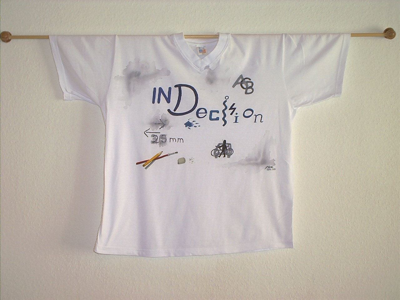
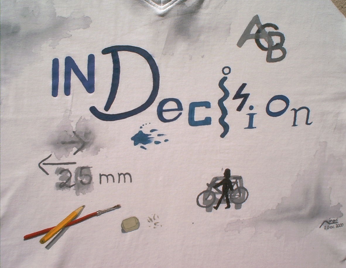
The reason behind this shirt is my own indecision. I was angry about my inability to decide what to do; e.g. how to go to work: I could take the bike, the car or the city railroad; or I could even walk. I tried to visualize my problem by placing those alternatives A, B, C on top of each other. I used different fonts, letter sizes and hues for the title. I tried to create a "sketchy" look, as if things have been rubbed out. The arrows indicate that the design should have been placed more on the right, no, wait, 30 eh 25 millimeters to the left?!
To underline the ad lib performance, I finally added a "photorealistic" pencil, brush and rubber. These elements provide a needed contrast, both in design and colors.
| date | 7 Dec 2000 |
|---|---|
| time | 1 day |
| object | T-shirt |
| technique |   |
I started without much consideration, invented the different font styles on the fly. To create the rubbed-out elements, I poured some water over the wet paint and spread the paint. For the pencil, brush and rubber, I built a real still model as a reference.


Note: These high-quality images take some time to load. Some images are sized to fit the page width, so try your browser's full-screen mode or resizing the browser window. If you want to view the picture in full detail and zoom into it, save the picture and use another imaging application to view it.
The images by Ingo Karkat on this page are licensed under Attribution-ShareAlike 4.0 International